
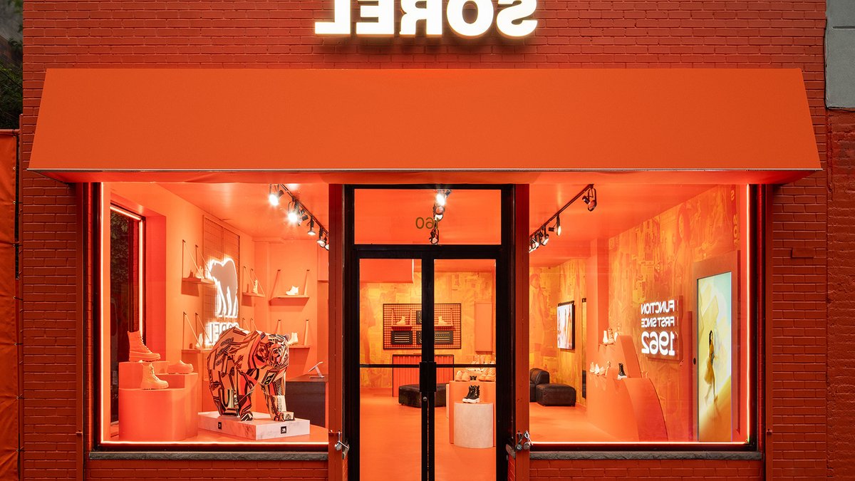
The Sorel Pop-up, designed by MG2, is a finalist in the 8th annual GRAY Awards, Retail or Showroom breakout category. The pop-up was created to celebrate the 50th anniversary of Sorel’s iconic Caribou silhouette.
Located in the Williamsburg shopping district of Brooklyn, New York, the 950-square-foot store featured the brand’s signature orange colorway. The space was designed to serve as a background for social media, with a marketing launch that included a marching band, young celebrities, and social media influencers.
Sorel Pop-up Design
The key to turning this tiny storefront into a compelling short-term destination was its full-color saturation. The interior and exterior of the store were covered in 25 gallons of Optimized Orange paint, making it hard to miss.
Inside, the store featured an interactive, augmented reality photo experience that invited visitors to immerse themselves in the brand. The digital engagement highlighted the “Polar Bear” boot style and paired it with weather elements to demonstrate its protection.
The imagery could be captured as a snapshot and posted on social media, resulting in thousands of posts on multiple platforms, including Instagram and TikTok, with 36 million media impressions.
Brand Moments
Past the AR Experience Mirror were other brand moments, including the Heritage Wall, a display of newly released Sorel footwear, the Customization Station, and a 3D artist’s interpretation of the polar bear logo. No one section was dominant, creating a beautiful symmetry of design elements, all in orange.
Related: Toronto bistro blends film and sculpture in bold redesign
The product itself was a key inspiration for how the merchandise was displayed. The orange fixtures with a wavy kinetic motif were a nod to the iconic Sorel styles. The Brand Heritage wall was a collage of vintage Sorel ads combined with new campaign imagery, color-washed in orange.
At the back of the space was an orange-drenched charm and lace personalization bar where shoppers could customize their boot purchases. Interior surfaces, including hard metals, gave a nod to the diverse mix of textures found in urban areas like New York City.
In comparison to other retail spaces, the Sorel Pop-up’s use of a single, bold color to create a cohesive brand experience is notable. This approach can be seen in other successful retail designs, where a focus on simplicity and consistency can create a lasting impression on customers.
Location and Design Process
Activating any space in Williamsburg for a short time in Q4 can be highly competitive.
Once the design team was convinced that this was the location they wanted, they vetted opportunities with their strategic counterparts who were able to determine that what needed to be done was possible with the time and budget allowed. The designers and construction management teams then worked in lockstep to craft an actionable plan and schedule.


